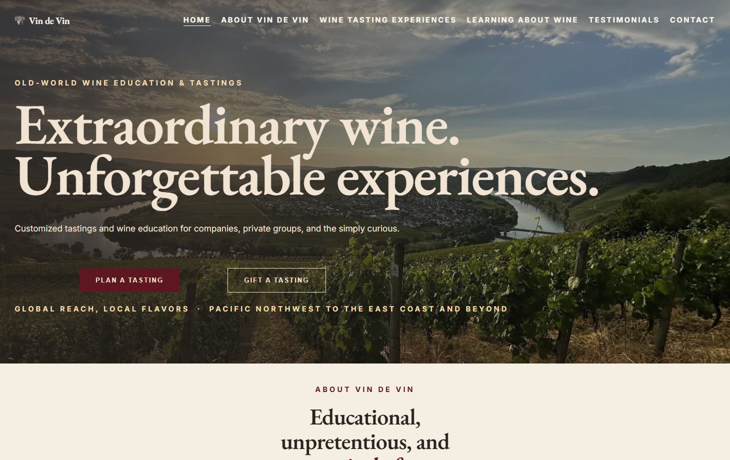
The decision that shaped this job came before any design: keep him on Squarespace.
Vin de Vin runs curated wine tastings and wine education, led by an owner whose credentials are the real product: Certified Specialist of Wine, Champagne Master, German Wine Scholar, and roughly thirty years of pouring for groups from the Pacific Northwest to the East Coast. That expertise came through the moment you spoke to him. The website hadn't caught up with him.
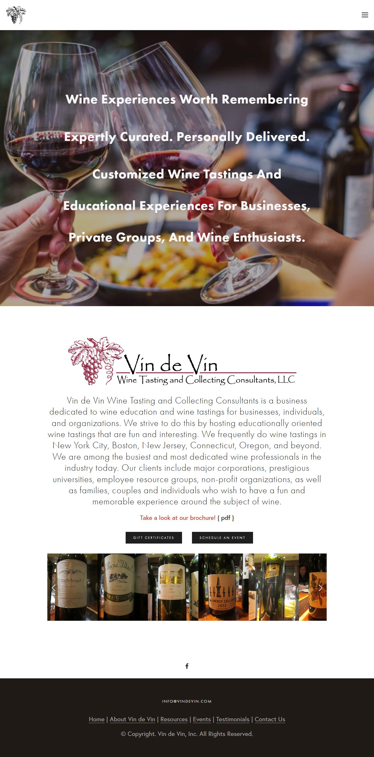
The site had been built on Squarespace years earlier and had worked well for him since it went up. It was still online, the contact form still worked, and people still booked through it. What it no longer did was represent him. The most recent event on it was from 2020. The navigation had grown a year-by-year row of event pages going back to 2003, twenty-one items across. The homepage had no real headline for search engines to read.
The obvious pitch, and the more profitable one, was a custom site off the platform entirely. I did not offer it. Here is why.
Why staying on Squarespace was the right call
He runs a one-person wine business. His job is wine; the website is overhead. He needs to add a tasting to his own site on a Tuesday evening without emailing anybody. He was already fluent in Squarespace's editor. Every hour of his attention is better spent on wine than on a way of working he would have to learn from scratch.
We could have gone bespoke and bought a better-looking result at a real price: a new place to log in, a new set of habits, and a call to me for every change. He heard both options with the tradeoffs named and chose to stay. Same platform, same editor, same login. New generation, new structure, new design.
The measure of a rebuild is not how much of it I got to design. It is how much of the business still works the morning after I hand back the keys.
Here is the part nobody explains up front. Squarespace comes in two generations. His site was made on the older one, 7.0; everything Squarespace sells today is 7.1. There is no upgrade button between them, and no amount of paying more will produce one. A 7.1 site is a brand new site: the content goes across page by page, the structure gets rethought on the way, and every old web address has to be pointed by hand at wherever it now lives. That is the real work, and it is why this costs what it costs.
What the audit turned up
The first job was an audit of the live site, before I touched anything, because the day it is replaced the evidence is gone. I configured my tooling to audit the whole site and capture the baseline.
That first number set the benchmark for the whole plan. It looked like a twenty-one page brochure. It was actually four hundred and thirty-four pages, because every individual tasting event since 2003 had its own page, complete with the duplicate slugs Squarespace generates when you reuse a title, and a scattering of typos in the URLs.
This matters for one reason: every one of those pages is an address that someone, or something, may still be pointing at. An old newsletter, a wine forum post, a search result. If those addresses break on launch day, the visitor gets a dead page, and he quietly loses the credibility those old pages had earned him.
So I did not guess the redirect map. I built it from the page list Squarespace itself publishes for search engines, which showed me a set of errors I would otherwise have shipped: the plausible-looking guesses were wrong. The real addresses were /2019-events-1, /2018-events-2, /vin-de-vin-2015-events. Nobody would have guessed those. Four hundred and thirty-four redirect rules, every one written from what the site actually served.
One thing the audit corrected in my favor, and against my own pitch. I had noted the brochure PDF as a broken download. It was not. Only the link text had broken; the file itself served perfectly. I took it off the defect list. If I cannot demonstrate a defect it does not belong on the list, and padding that list would have been the easiest thing in the world to get away with.
The archive was worth more than it looked
The instinct with a decade of stale event pages is to delete the lot. Reading them changed the plan. The 2016 to 2020 pages were not filler: they documented real eight-wine flights with producers, vintages, and critic scores. That is genuine wine writing, and it is exactly what makes people trust a site like his.
The pages from before 2013 were mostly photo carousels, and those were easy to let go. So the archive got triaged instead of dumped: forty-eight of the strongest events came back as proper posts with their photos, and the rest redirected cleanly and retired.
Structure: one page nobody has to maintain
The twenty-one item navigation was a symptom. The cause was that every year of events needed somewhere to live, so every year got a page, forever.
The fix uses nothing but native Squarespace pieces. Every tasting becomes a post in one Past Events collection, and the home and Experiences pages each carry a summary block showing the most recent few. Publishing a new tasting pushes it to the top, and he never has to touch the older ones; they drop off those pages automatically as he adds new ones, and stay in the collection, reachable but out of the way. One collection, self-archiving, no annual maintenance, and nothing for anyone to remember to prune.
Designed to hold on whatever plan he is on
This is the constraint that shaped the visual work, and it came out of thinking about his monthly bill rather than about the design.
Squarespace only allows custom CSS from its Business tier up. The tempting move is to design heavily in CSS, which buys a far more distinctive site. The trap is what happens later: if he ever moves down a plan, custom CSS switches off, and a design leaning on it comes apart. He would be paying the higher tier indefinitely to keep his own look intact, which is a decision made for him by a designer he no longer works with.
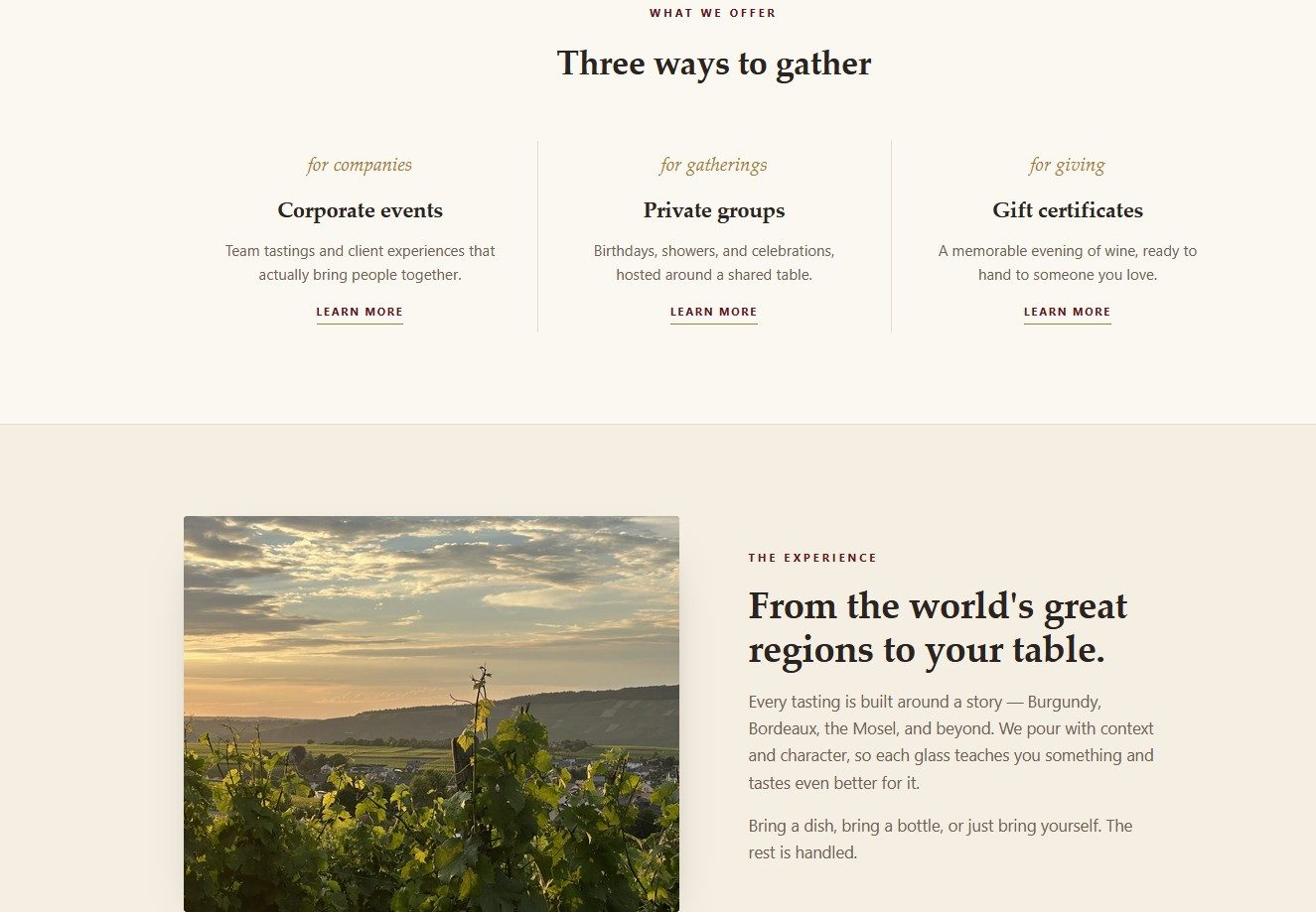
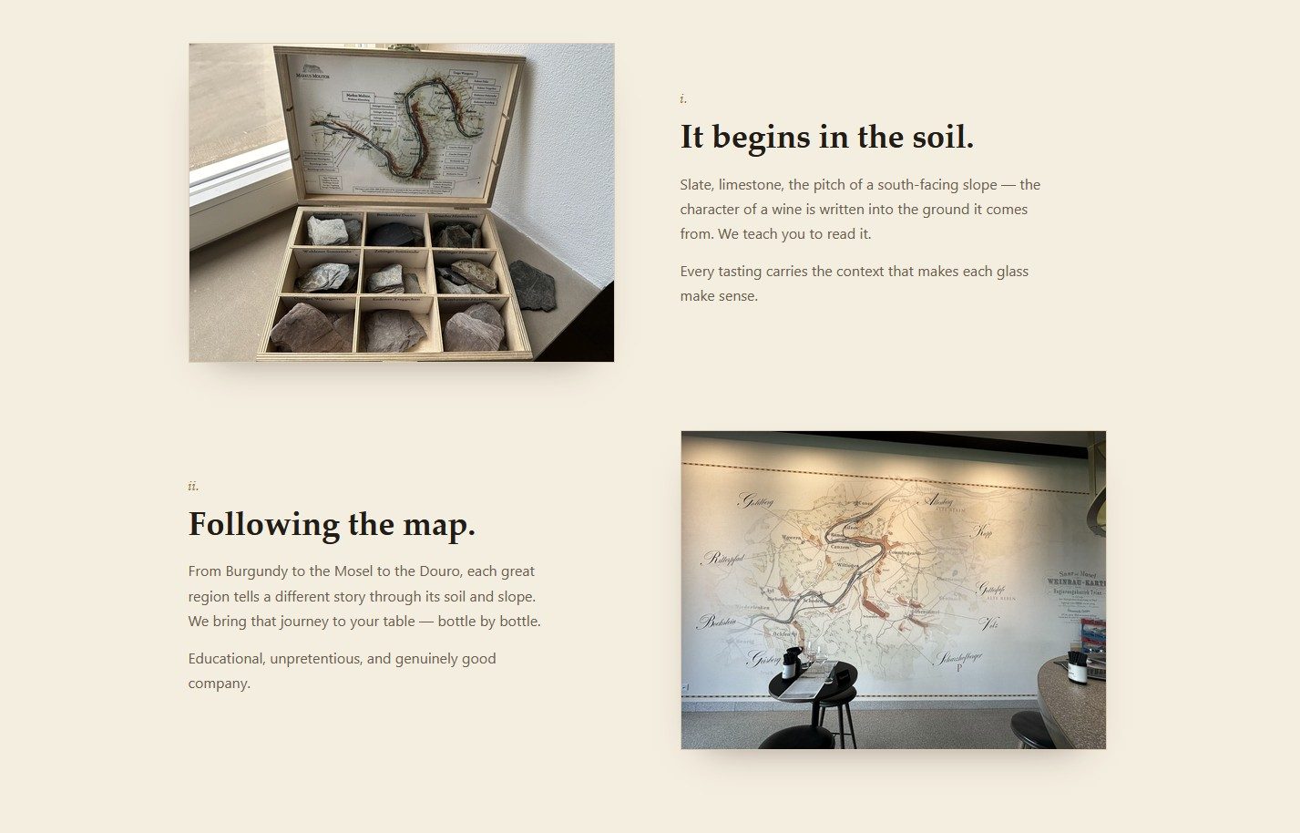
So the design was made out of 7.1's own style controls, the ones on every plan, with CSS treated as disposable polish. I measured the two leading directions against that standard and put the numbers in front of him: one came in at roughly 92% native with a single decorative snippet, the other at 78% with three snippets, two of them holding the layout up. He knew that number when he chose, and nobody would have had it by designing first and costing later.
Two other pieces of honest bad news, raised rather than buried:
- We could not keep the typeface from the comps. Squarespace offers Palatino on no tier. Rather than a silent swap to something approximate, I ranked the alternatives and walked him through the tradeoffs, and he picked with his eyes open.
- I noticed my comps had drifted off his brand color. Sampling the red from his actual wordmark showed it to be #922C46, and I had deepened it without meaning to. That is the kind of small unauthorized change that erodes a brand, so I sent it to him for sign-off instead of hoping he would not notice.
The rest of the groundwork
The visible redesign is maybe half the job. The other half:
- Every image reprocessed. The gallery was around thirty full-size camera JPEGs still carrying names like
IMG_5848.JPG. Beyond the weight, modern photos carry hidden data that can include GPS coordinates, so publishing them can publish where they were taken. I strip that unconditionally, scale the dimensions for the web, and re-encode everything for modern delivery. - Search groundwork. A real page title led by what people actually search, a description inside the length a search engine will show, structured business data, and a share card that renders properly when someone posts a link.
- Copy in his own words. His newer about page was already well written, so it stayed. I drafted new copy from his existing material and his own voice, and he had the final edit.
- Everything written down before assembly. Copy block by block for all six pages, the redirect rules, the page data, the form specification, and the style settings, all settled on paper first, so putting the site together was pure execution.
What carries into the next one
- Audit the old site while you are still pitching it. The baseline is the most persuasive thing you can put in front of a client, and it stops existing the day you launch.
- Never guess a URL you can read. Generating the redirect map from the live sitemap caught wrong assumptions that looked entirely reasonable.
- Design against the plan the client will actually be on in two years, which is rarely the one that shows your work best.
- Read the archive before deleting it. Some of what looks like clutter is the most credible content on the site.